Reference* library
Website of a non-existent library that curates a cherry-picked list of books for developers.
The biggest challenge
Goddamn book covers.
It turns out there's no unified image ratio for them. And since this app is all about books, the BookCard component has to look good.
Here's the problem statement:

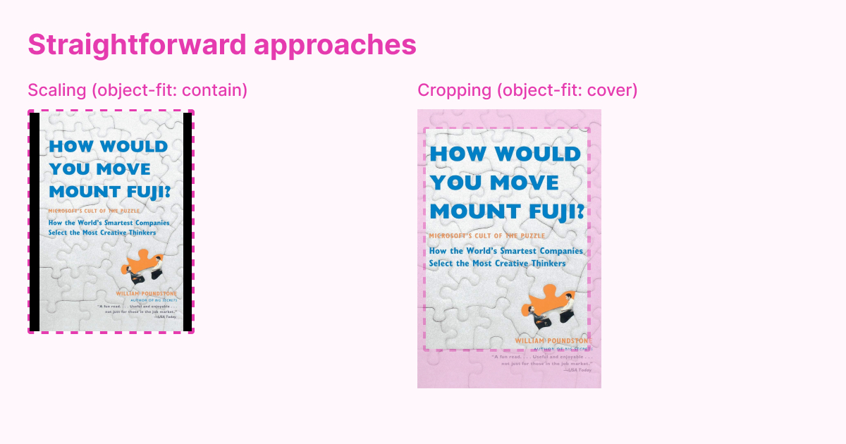
Some images don't quite fit the cover frame. There are basically two ways to solve it – either by scaling the image until it fits either height or width of the frame, or crop it so it would fit the frame entirely:

- When scaling images, we're leaving either horizontal or vertical space out. UI-wise it looks awful as makes the images look chaotic.
- Cropping solves the UI chaos, but we can crop out some text from the book cover. That's exactly what I tried to show on the second (way more exaggerated than it needed to be) example.
✨ AI ✨ comes to the rescue
I use Cloudinary to handle imagery on this project. They have this thing called Generative fill that allows to scale an image to required proportions and fill the missing parts with AI:

The only downside to it is that it makes uploads way slower. But I was good with it since it's only available to admins.
One cool side-effect I noticed is that sometimes the AI hallucinates and produces cool glitches:

IMO it looks awesome and adds some seasoning to the imagery on this project, but I'd never use it to process any actual user input.
Palette & Basic elements
Before this project, I always thought Material UI made your stuff look like bootleg Google websites. But actually it provides you with solid foundation (grid, color palette, form elements) to build something neat on top of it.
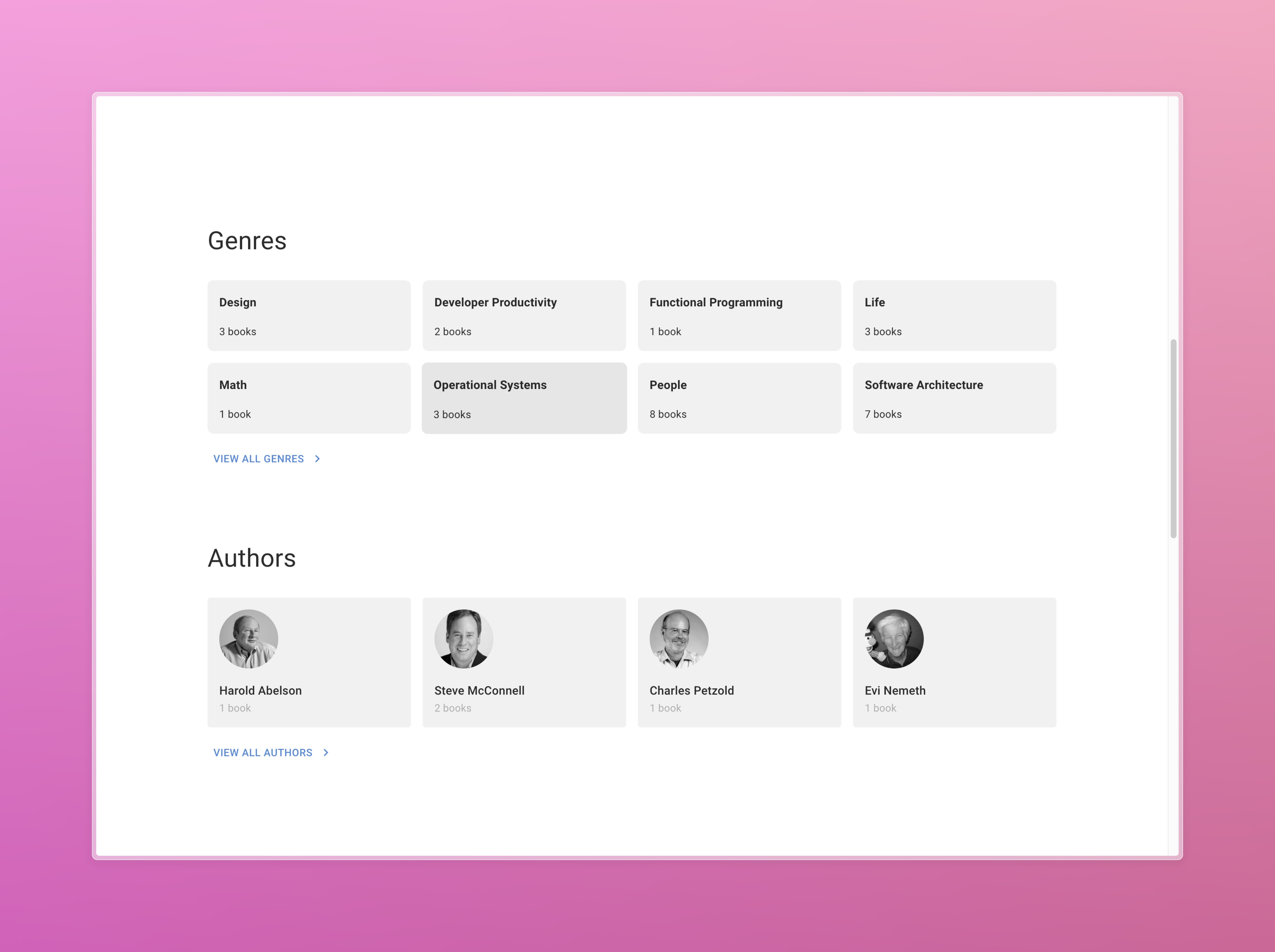
For example, I used a lot of card elements in this project:

All of those are standard <Box /> components, since I find <Card /> too opinionated for my needs. For the background color, I use this function:
// utils/composeBackgroundColor.ts

export default function composeBackgroundColor(
  theme: Theme,
  level: number = 0
) {
  const step = level * 100;
  return theme.palette.mode === 'dark'
    ? theme.palette.grey[
        (900 - step).toString() as keyof typeof theme.palette.grey
      ]
    : theme.palette.grey[
        (100 + step).toString() as keyof typeof theme.palette.grey
      ];
}
Feedback
I believe one of the most important aspects of making an interface look alive is making it responsive to user's actions.
As some HTTP-client libraries suggest, we can divide user's actions into two categories:
- Querying – getting some data from the data source;
- Mutating – changing some data on the data source.
Queries
When it comes to querying, RTK-Query provides useful handlebars to implement feedback:
// from rtk-query docs
const { data = [], isLoading, isFetching, isError } = useGetPostsQuery();
With these, we can react to different states of the interface accordingly.
My favorite thing to do here when I handle lists is to implement Finite State to check on loading, error, list and empty states:
At first, I define all possible states with plain strings:
const AUTHORS_LOADING = 'LOADING';
const AUTHORS_ERROR = 'ERROR';
const AUTHORS_LIST = 'LIST';
const AUTHORS_EMPTY = 'EMPTY';

type AuthorsState =
  | typeof AUTHORS_LOADING
  | typeof AUTHORS_ERROR
  | typeof AUTHORS_LIST
  | typeof AUTHORS_EMPTY;

// Later, in the component code itself:
const [state, setState] = useState<AuthorsState>(AUTHORS_LOADING);
Then, there's this useEffect that connects to the handles from RTK-Query and updates the state accordingly:
useEffect(() => {
  if (isFetching) {
    setState(AUTHORS_LOADING);
    return;
  }

  if (isError) {
    setState(AUTHORS_ERROR);
    return;
  }

  if (authorsResponse?.data.authors.length === 0) {
    setState(AUTHORS_EMPTY);
    return;
  }

  setState(AUTHORS_LIST);
}, [isFetching, isError, authorsResponse?.data.authors.length]);
All this setup allows me to render the component in an understandable, readable manner with simple flags:
return (
  {state === AUTHORS_LIST && renderList(authorsResponse?.data)}
  {state === AUTHORS_LOADING && renderSkeletons()}
  {state === AUTHORS_EMPTY && (
    <ListEmpty
      title="No authors found"
      description="Please try changing the filters."
    />
  )}
  {state === AUTHORS_ERROR && (
    <Grid item xs={12}>
      <DisplayError
        title="Uh oh, failed to fetch authors"
        errorOutput={error}
      />
    </Grid>
  )}
)
Mutations
RTK-Query returns isError and isSuccess flags from useMutation hooks, but I'm way more used to Apollo's onSuccess and onError callbacks. Here's my mutations wrapper that introduces those:
// utils/handleAsyncOperation.ts

export default async function handleAsyncOperation(
  submitFn: () => Promise<any>,
  {
    onSuccess,
    onError,
    fallbackErrorMsg = 'Unknown error happened.',
    expectEmptyResponse = false,
  }: InputHelpersType
) {
  try {
    const result = await submitFn();
    if (
      !expectEmptyResponse &&
      _.get(result, ['data', 'status'], 'error') === 'error'
    ) {
      const error = _.get(
        result,
        ['error', 'data', 'message'],
        _.get(result, 'message', fallbackErrorMsg)
      );
      onError(error);
      return;
    }
    onSuccess(result);
  } catch (error: any) {
    const errorMsg = _.get(error, 'message', fallbackErrorMsg);
    onError(errorMsg);
  }
}
From there, I pass form state updates to onSuccess and onError:
await handleAsyncOperation(() => onSubmit(valuesToSubmit), {
      onSuccess: () => {
        setFormState('SUCCESS');
        setMessage(successMessage);
        resetOnSuccess && resetForm();
      },
      onError: (error) => {
        setFormState('ERROR');
        setMessage(error);
      },
    });